
Readability or visual understanding of any language depends upon not the language or script itself but the font or style we use to represent that text. It doesn’t matter how complex the language is; if it is written in a legible way, the readers can easily grasp the concept. The same goes for Urdu typography; what you write is not important, but how you represent it matters. Therefore, in this assessment, we are going to educate our newbie designers and writers about how they can enhance the readability of their design projects by simply choosing the right fonts. Here, we will discuss the types of scripting techniques briefly and explain how they affect your Urdu Typography. We will also discuss some tips and tricks about how can your font selection increase the legibility of your Urdu text by simplifying it. These small but efficient tips for Urdu font selection can prove truly effective for you typographic projects. Also read more about 9 Timeless Urdu Fonts that continue to be popular for various uses.
There are thousands of fonts specifically designed for your Urdu typographic needs. All of these fonts have drawn inspiration from at least one or multiple scripting techniques we are going to discuss below. However, before we explain how each one affects your Urdu text’s readability, it would be nice to give you a brief intro about them. There are basically 6 techniques that originated in different eras by different civilizations. Let’s have a peek at their history and origin. Moreover, get insight into Arabic Calligraphic Scripts and their role in define today’s Urdu scripting languages.
| No. | Script | Origin | Era | Appearance |
|---|---|---|---|---|
| 1 | Naskh | Arabian Peninsula | Pre-Islamic – Present | Simple, angular letters, consistent width, horizontal strokes |
| 2 | Nastaliq | Iran | 10th Century AD-Present | Derived from Naskh, more slanted and flowing, allows for creative letter connections |
| 3 | Kufic | Iraq | 7th – 16th Centuries AD | Geometric, angular letters, strong horizontal emphasis, often used for Qur’anic inscriptions |
| 4 | Ruqqa | Iraq | 8th – 15th Centuries AD | Rounded and cursive letters, faster writing style, often used for administrative documents |
| 5 | Thuluth | Iraq | 10th – 19th Centuries AD | Bold, monumental letters, thick strokes, often used for architectural decoration and headings |
| 6 | Diwani | Ottoman Empire | 15th – 19th Centuries AD | Highly ornate and cursive script, complex letter connections, used for official Ottoman documents and calligraphy |
While each script possesses a unique beauty, its impact on readability in Urdu typography can vary significantly. These techniques provide a ground for font developers and designers to play with their creativity. Here’s how these scripting styles affect readability:
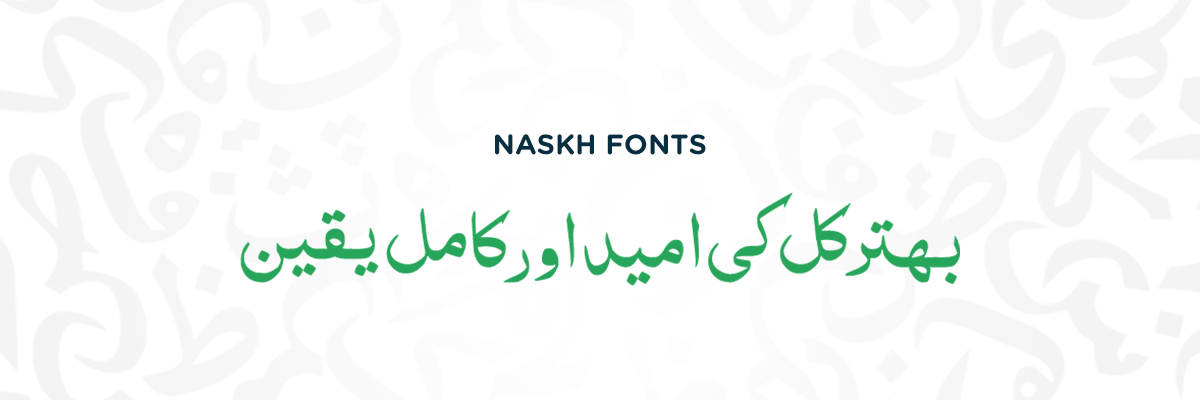
Naskh is generally considered the most readable script in Urdu due to its simplicity and clarity. Its soft letters with consistent width and emphasis on horizontal strokes create well-defined characters. This makes it ideal for body text and everyday use.
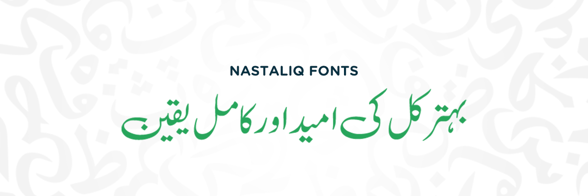
Derived from Naskh, Nastaliq offers a more elegant and flowing aesthetic. The slant and beautiful letter connections can add visual interest. It maintains good legibility, particularly in smaller sizes, with appealing aesthetics. It’s a good choice for all kinds of texts, headings, or long and short passages where readability with aesthetics are needed.
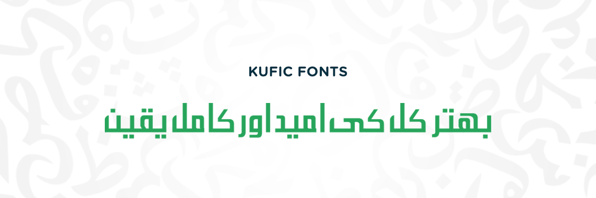
The geometric and angular nature of Kufic script, with its strong horizontal emphasis, can make it challenging to read long passages in Urdu. While its bold strokes make the text pop up on the screen but its maze-like appearance is no good for long passages. Therefore, it’s not ideal for everyday text due to the lack of clear letter differentiation. If you like this font, learn more about our 12 best Urdu Kufic Fonts, perfect for Kufic calligraphy and art.
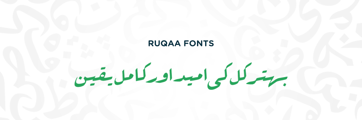
Developed for a faster writing style, Ruqqa utilizes rounded and cursive letters. While offering a certain level of readability compared to Kufic, the cursive nature can make it difficult to separate individual characters, especially in smaller fonts. It might be suitable for short notes or informal writing but not ideal for extensive reading.
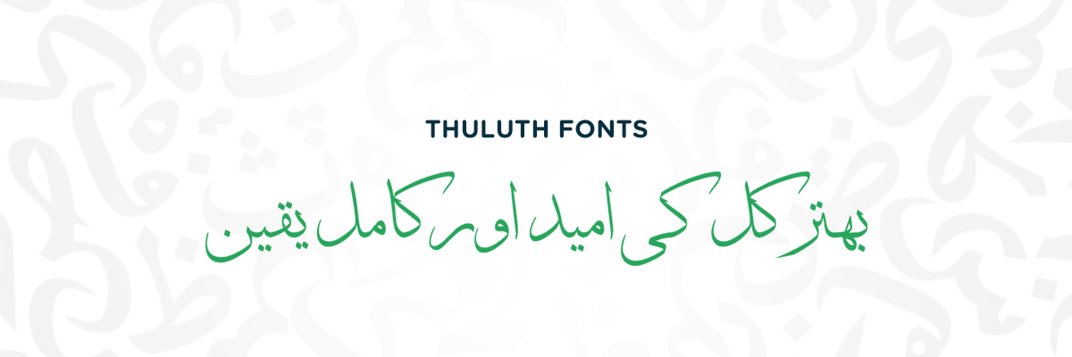
The bold, sharp, and slanted nature of the Thuluth script makes it visually impactful. However, its thick strokes and focus on decoration can reduce readability for long stretches of text in Urdu. It’s best used for short passages like headings or decorative elements where legibility is not a priority.
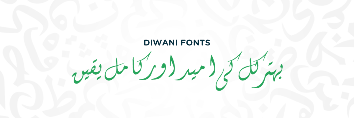
The highly ornate and cursive nature of Diwani script, with its complex letter connections, makes it the least readable option for Urdu typography. Designed for aesthetics and a form of official script, Diwani is more like an art form than a functional writing style. It’s rarely used in modern Urdu text due to its illegibility for the average reader.
So, after knowing the typographic styles and their effect on Urdu text readability, we conclude that the best fonts for increasing the appeal and clarity of your texts, Naskh and Nastaliq fonts are the best choices. Where Naskh offers a clear image, Nastaliq adds a little flair of aesthetics to the rawness of your Urdu typographic projects.
When it comes to legibility, forget about the overly done decorations. Go for the typeface that offers an uncluttered appearance and avoids excessive decorations to complicate the design. Here are some tips and tricks you can apply while selecting a font for your project to increase its readability. Follow these, and make you’re your text look accessible and welcoming. Also, read our guide to choose best Urdu Fonts for Logo Designs to create trendy business logos.
Choose fonts with clean and well-defined letterforms. Avoid overly decorative or script-like styles that can be difficult to read, especially on small screens.
Simpler fonts are generally easier to read. Opt for clean lines and avoid overly complex designs. Naskh and Nastaliq-inspired are the best for this.
A good contrast between text and background makes reading easier. Avoid light text on light backgrounds or dark text on dark backgrounds.
There’s a reason why body text is larger than headlines. Ensure your font size is appropriate for the content and viewing distance.
Bolding and italics can add emphasis, but overuse reduces readability. Use them only for important points instead of opting for a thick or slanted font for large text paras.
Kerning refers to the spacing between letters. Proper kerning avoids awkward gaps or letters appearing crammed or condensed together. It gives your font a more modern look while increasing its legibility.
Consider who will be reading your text. For children or those with reading difficulties, opt for clear and familiar fonts. Also, go for the fonts that maintain the elegance of Urdu if your target audience is local.
Don’t be afraid to experiment! Look at your chosen font size and style on different devices to ensure it remains readable across platforms. This practice allows you to refine your Urdu text for different applications according to varying needs.
Another day with some interesting and helpful knowledge about utilizing Urdu fonts for an enhanced typographic experience. At urdufonts.com, we not only provide our readers and designers with a collection of the best and most compatible fonts but also pay heed to how they can complement their different designs with our insight. We provided you with the understanding you can use to make your lengthy text projects look more appealing and visually comprehensible for a diverse audience to read. These seemingly basic points can result in high reach. The simpler and more elegant it looks, the more easily the readers can grasp your idea or message. So, keep on reading and applying these tips to your projects for a more readable and fulfilling Urdu typography.
No comments yet
Compatible with most of the software which are of mobile, desktop and websites.