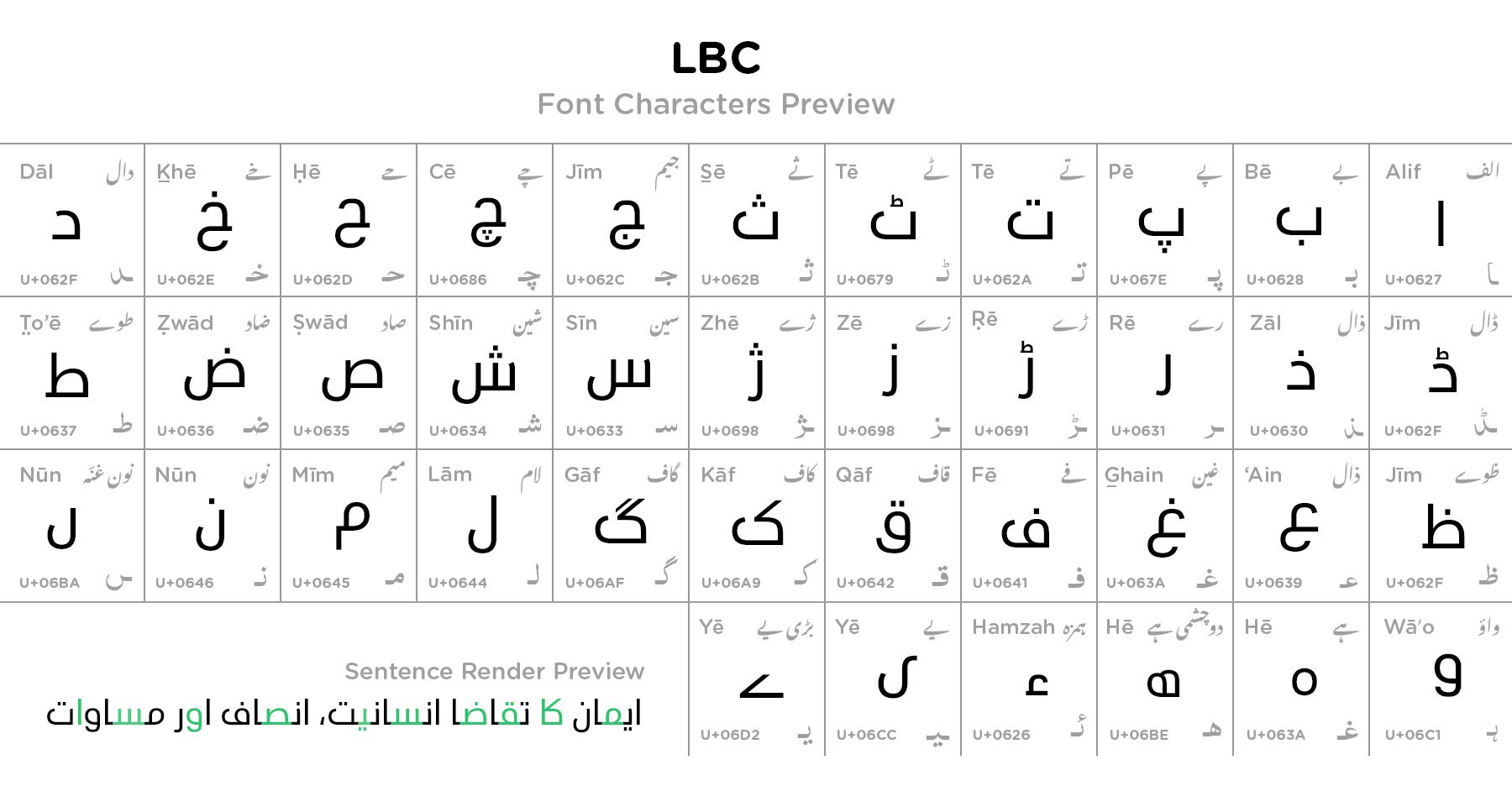
The LBC font has a bold and structured look. The letters are evenly spaced, making them easy to read. The letters are evenly spaced and uniform in weight, making them easy to read. It has 3755 number of glyphs. The font has sharp edges that makes it suitable for digital screens. The letters connect smoothly, ensuring readability. The LBC font follows a geometric design, meaning that the letters have a balanced and well-proportioned shape. It has sharp angles and smooth curves. The font has a bold appearance and the thickness of the letters ensures high visibility. Despite being bold, the spacing between letters is carefully designed to maintain clarity. The edges of the letters are sharp and precise. It is available in 2 different weights, including:
LBC Regular
LBC Bold
The font follows the natural connectivity of Arabic script while maintaining a structured feel. The baseline of the letters is uniform. This means all the letters align perfectly without excessive variation in height. The letters are clear even at small sizes, making it suitable for both print and online media, UI/UX, branding, news graphics, Arabic typography, websites, and news channels.