UrduFonts.com is the largest online repository, which provides high-quality Urdu fonts. Each font in our collection is a carefully selected, tested and made available for free.
UrduFonts.com is the largest online repository, which provides high-quality Urdu fonts. Each font in our collection is a carefully selected, tested and made available for free.

Urdu fonts, like any other script, offer style variations, each with its unique set of characteristics and uses. Understanding these primary styles is essential for both designers and typographers, before putting any font to actual use. Comprehending the idea of the diverse nature of font styles and how they affect your work enables you to pick and choose the right font for various design contexts. From the bold impact of Black fonts to the elegance of Calligraphy, the playful charm of Cartoon Style, and the nostalgic effect of Chalk Writing, each style serves a specific purpose in visual communication.
Submerging ourselves into these styles opens up a world of creativity, fertilizing the typographic landscape of Urdu design. So, before moving to choose the font itself, it is necessary to understand the style it is based on, for making an informed decision.
The right font will not only give life to your words, but it makes it easier for the reader to grasp the depth of the concept you are trying to depict. Get into the world of Urdu typography as we have curated collection of the top 24 font styles given below.
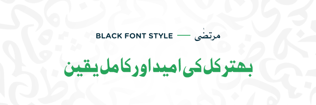
Black refers to a font with more weight than the fonts regarded as bold. It is thicker and denser than the casual bold weight giving your text a more impactful vibe. Black styles offer a sense of heaviness and force, as well as emphasize the font’s existing features, which are hard to convey using more neutral and weightless forms. Such font designs create a strong emotional response, which is why they are often used in gaming, advertising, and show business. Moreover, they can be also used for headlines, posters, and branding due to their high impact and legibility, even in smaller sizes. Popular black Urdu fonts include Jameel Noori Black and Jawi Black.
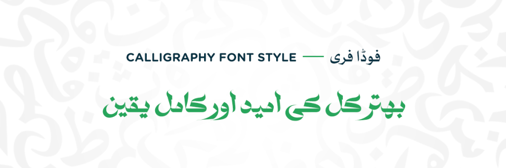
Calligraphic typefaces, drawing inspiration from traditional Arabic arts of inscribing, are an exquisite form of handwriting. They frequently appear to have been created with flat-tipped pens or brushes; in some cases, they even feature the drips, stains, blotches, and imperfections that distinguish hand-drawn letters. Unlike scripts, a calligraphic font’s lowercase letters are typically not joined. Styles range from historical and formal to edgy, lively, and heartfelt. Calligraphic fonts are often best used in display design and may be ideal for creating personalized invitations and greeting cards. These are perfect for projects that require a feeling of personality, such as posters, book covers, and CD packaging. Examples of such fonts include Shehzad and Diwani Nastaliq.
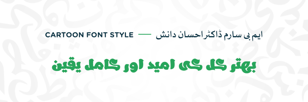
Cartoon style is a playful and fun category of fonts designed to evoke the look and feel of cartoon animation. Compared to standard fonts, cartoon fonts often have a larger letterform, like wider curves, thicker strokes, and more pronounced serifs. Think of the bold outlines and bouncy shapes you see in comic books and animated characters. While some prioritize the overall look and feel, others balance it with readability, making them perfect for shorter text or eye-catching headlines. Fonts that are based on cartoon style are perfect for children’s books, animations, and informal designs. Some popular options include Aladdin and Chocó.
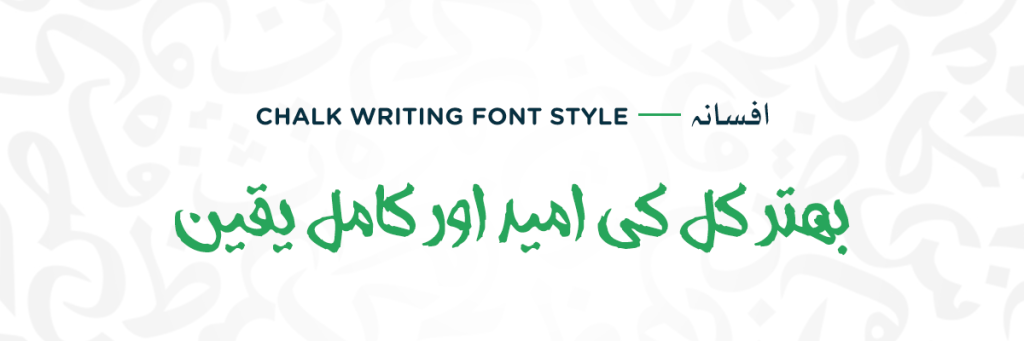
Chalk Writing style fonts give off a nostalgic vibe, like the writing on a chalkboard. They have a casual and relaxed feel, perfect for creating a cozy atmosphere. They typically have irregular strokes and slightly rough edges just like the texture of actual chalk on a rough surface. chalk-writing fonts are easier to read but not suitable for longer texts. These fonts are great for cafe menus, vintage designs, and handmade items. They add a personal touch to projects, making them feel warm and inviting. Kamva and Arif are some examples of chalk-writing font. These unusual fonts with their untidy strokes give your text a natural hand-written feel.
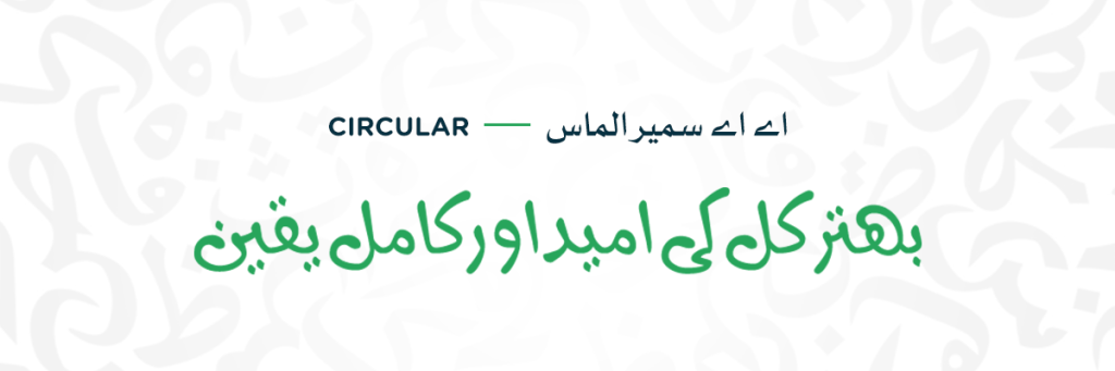
Circular fonts feature soft and rounded letterforms, creating a friendly and welcoming outlook. The characters are highly decorative with smooth curves and elongated curly terminals. They are commonly used in children’s products, branding, and logos, thanks to their playful and inviting look and feel. With smooth curves and gentle strokes, circular fonts display warmth and charm. They are diverse and suitable for different design purposes, from websites to advertisements. Their rounded shapes increase readability and make them ideal for conveying a friendly atmosphere. LH Lamar Pro and Wahaj fall in the category of circular font. Such styles are often used where we need a little playful flair of old scripts blending with modern styles.
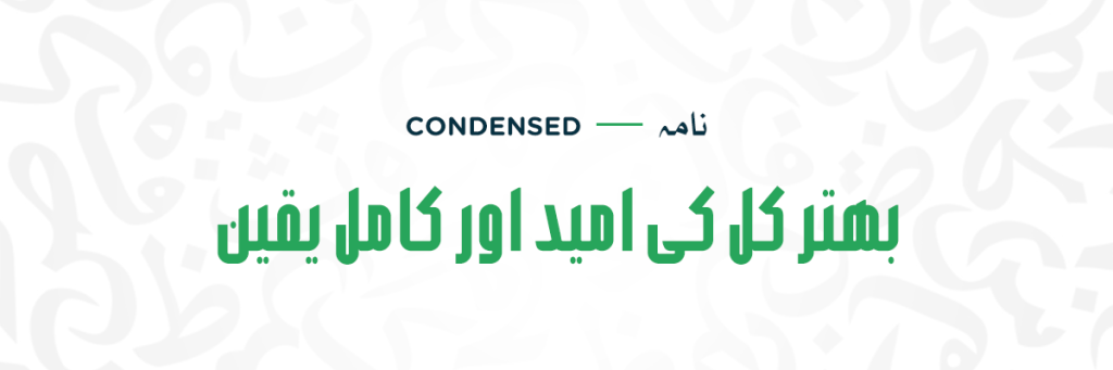
Condensed font styles can be identified by narrow letterforms and tight spacing between characters. With their smooth yet congested design, condensed fonts create a modern and sophisticated look. Despite their narrow and tight look, condensed fonts maintain legibility and are suitable for various design applications. Text is easier to read in larger resolutions however, the letters get fused when used in smaller resolutions. Thus, limiting its useability to smaller texts. Moreover, such style can also be defined by a taller outlook instead of a wider one. They are ideal for saving space in text-heavy layouts like newspapers and websites. Popular condensed fonts include AlQalam Ishtiaq, Sarem Abdullah, and Jameel Noori Nastaliq Condensed.
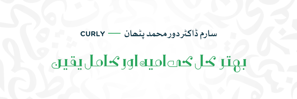
Curly fonts, giving off a soft yet intricate outlook can be characterized by their fancy loops and extended swirls, adding decorative flair to letterforms. They often include extra design elements like dots or ornaments for added visual appeal. While some are detailed on a complex level, others offer a simpler, more subtle style, catering to various design needs. They are Unsuitable for body text due to their decorative nature, as they can be difficult to read in smaller sizes. Therefore, such fonts are better for short bursts of text or headings and pairing them with clearer fonts for body text. Curly style adds elegance and personality to invitations, wedding stationery, and decorative elements. Explore fonts like Nazanin and Noorsoft.
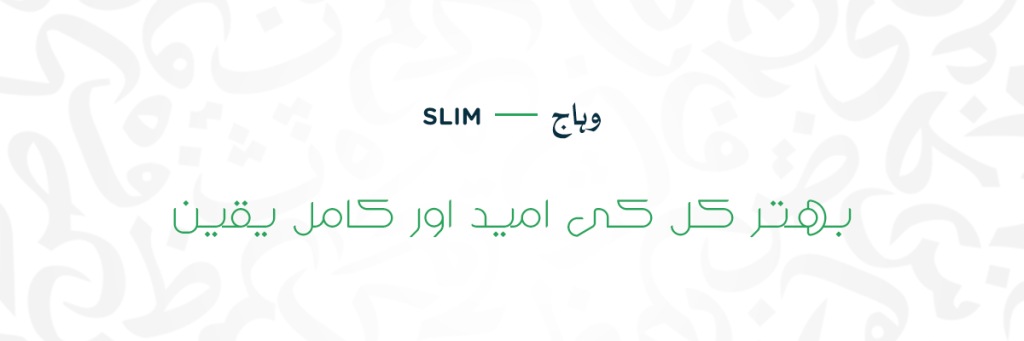
Slim fonts are similar to condensed but with a focus on thinness. They offer thin, light strokes, making them look streamlined. Small space within and between the letters creates a feeling of sophistication. Slim-style fonts are characterized by their clean lines and reduced letter width, creating a sleek and streamlined appearance. This type of font style is preferred where decoration is not a priority. Despite their thinness, they maintain readability and are suitable for various design purposes, including titles, logos, and body text in minimalist layouts. Iranica and Muslimah fall in the category of slim styles.
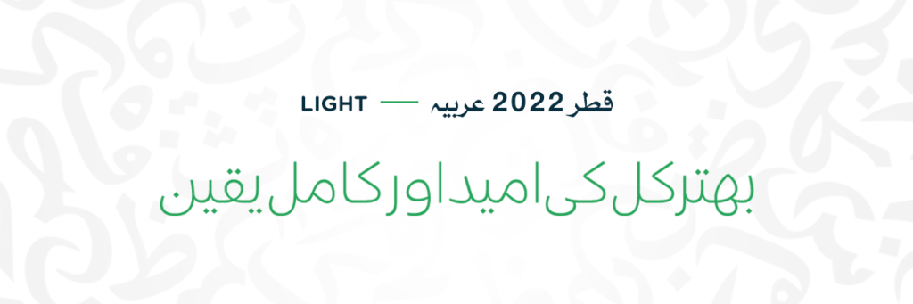
These fonts embrace thin lines and reduced weight, creating a feeling of lightness and delicacy. Light font styles have thin and slender strokes, making them appear almost light and feathery; they have a weightless feel. This font style is less bold than regular, suitable for body text and longer passages for improved readability. Some light fonts have small decorative strokes at the ends of letters, called serifs, but many avoid these decorations and offer a clean and minimalist appearance. Light fonts often avoid complex curves and embellishments, relying on basic geometric forms for a sleek look. However, if used incorrectly, it makes your text harder to read. Therefore, assess your needs before applying it. Some light font styles include Hamada Light, Vexa Light, and more.
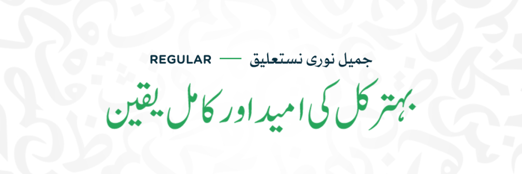
Regular style in any font family is considered a proto-type style, meaning it is clean in its standard weight. It is easy to read and understand, making it great for all kinds of text. With its clean stokes, it conveys reliability and professionalism, making it perfect for longer texts, headlines, websites, and print materials. In some cases, “regular” might simply indicate the absence of any additional stylistic attributes, like outlining, shadowing, or decorative elements. However, “Regular” can also imply the default weight of a font, compared to bolder or lighter variations within the same family. For example, Helvetica Regular might be thicker than Helvetica Light. While lacking decorative elements, regular-style fonts are versatile, providing a neutral foundation for conveying information effectively in a wide range of contexts.
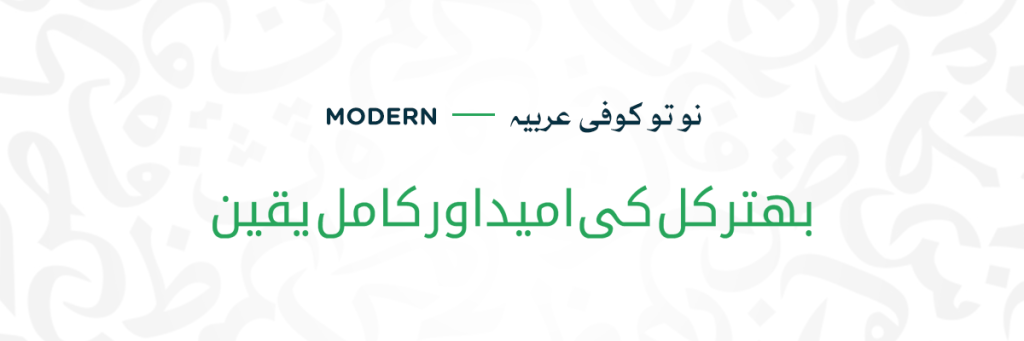
Modern fonts have a sleek and simple style, with clean lines and sharp edges. They’re often used in websites, apps, and tech designs for a modern and professional look. This type of font style offers a sleek, polished, and tech-driven look to your text. Modern fonts often embrace simplicity, focusing on clear lines, geometric shapes, and a lack of unnecessary frills. They give off a sense of innovation. Popular modern Urdu fonts include Lato Nastaliq and Amiri Quran. These fonts are versatile and easy to read, making them great for various design needs. With their clean and contemporary appearance, modern fonts add a stylish touch to any project.
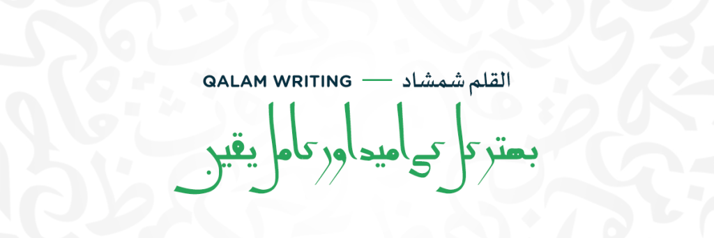
Qalam writing style embodies the beauty of traditional calligraphy, with its elegant and flowing letters. The font style captures the natural and dynamic nature of hand-written calligraphy, with varying stroke thickness and delicate imperfections. Moreover, they can have rounded curvy corners and long sharp edges with tiny flicks at the end, giving it a more decorative feel of traditional Arabic calligraphy. It displays a sense of sophistication, perfect for formal occasions like certificates and invitations. Their sharp angles, elongated lines, and delicate embellishments evoke a sense of tradition, artistry, and timeless heritage. Such styles are perfect for religious texts, certificates, and formal invitations. Examples include Adoody, Lahori Nastaliq, and Nasta’liq Qalam.
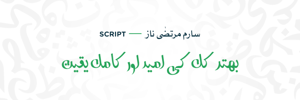
Script font style embraces the real beauty of handwriting. Unlike standard fonts, the letters in script fonts often join together, creating a continuous and flowing appearance. With slanted letters and loops, thick and thin strokes at the end, add a vibrant touch to the text. Script style follows the traditional calligraphy that stretches, curves, and joins in many ways, resembling human writing. This cursive style can be used for invitations, greeting cards, logos, certificates, and wedding invitations. The graceful curves and decorative elements of script fonts help grab attention and add a touch of elegance to titles and headings. However, its cursive nature can limit its usability to only shorter texts with slightly larger resolutions, such as fonts like Farsi Script and Kehkash.
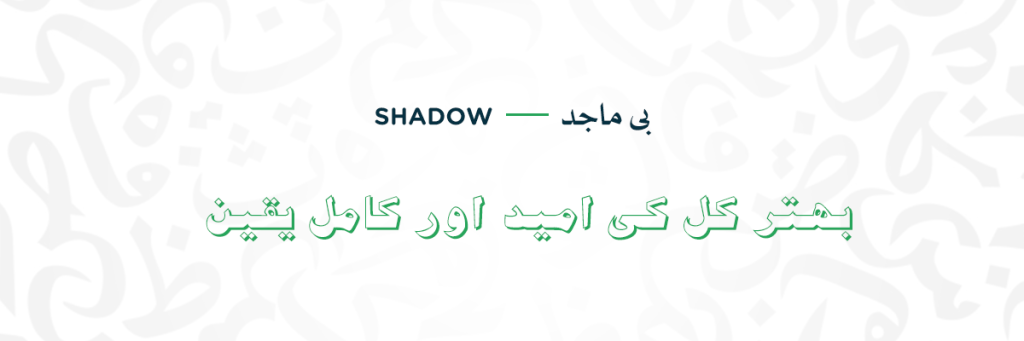
Shadow-style fonts create depth and dimension, adding a captivating effect to the text. Each letter appears to cast a shadow, giving a 3D illusion and making them visually striking. Each letter has two sides, a solid form and a shadow following behind, leaving the interior empty and forming a hollow look. They are often used for logos, posters, and headings to grab attention. The shadows enhance the boldness of the letters, making them stand out against the backgrounds. This kind of font style is perfect only for shorter texts, therefore, maintaining a high legibility against the background. B Majid Shadow is an ideal example of a shadow font style.
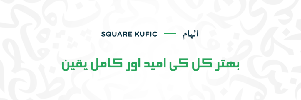
Square Kufic style is inspired by the traditional Kufic script. The letters lack curves and embrace sharp angles, highlighting the original Kufic design elements. It contains bold squares, triangles, and sharp edges. The letterforms are wide and thick with equal spacing between them. However, it is rarely used in contemporary Urdu fonts due to its historical and religious context. The angular shapes and decorations produce a sense of ancient scripts, adding a touch of uniqueness to them. Unlike other Kufic styles, Square Kufic avoids excessive interlinking of letters, giving off a cleaner and more organized look. It is often used for decorating mosques, and buildings, and sometimes in different graphic designing needs. AA Kashida and Ithra are the perfect examples of the Square Kufic style.
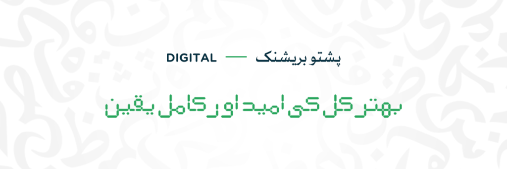
Digital style fonts have blocky, bold letters with straight, geometric lines, giving them a modern and tech-savvy appearance. It mimics the appearance of letters on digital clocks and calculators. They are often used for digital platforms like websites, apps, and gaming interfaces, as well as for headlines and titles in printed materials. The fonts based on digital style are highly legible and adaptable, bending and stretching to fit various design needs. Such fonts are also known as Bitmap typefaces. Somehow, pixelated fonts also fall in the category of digital designs. With its crisp, sharp edges and symmetrical design, digital style offers a clean and contemporary look, making it ideal for conveying information clearly across digital media. Pixopedia is an example of such a style type.
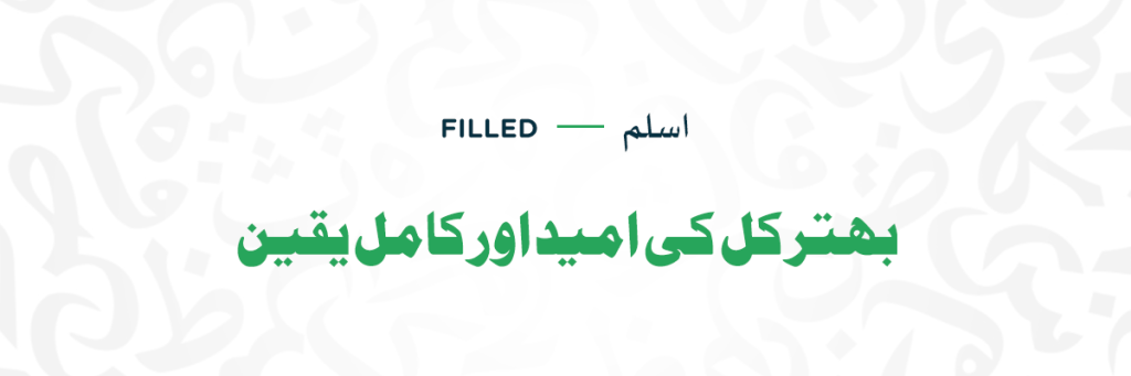
Filled fonts are characterized by solid, bold letterforms with no outlines, creating a strong and impactful appearance. These fonts have thick, chunky lines that give them a substantial and weighty feel. They don’t have hollow spaces in between. Their bold, less decorative, thick, and geometric elements make the letters. They are less decorative compared to other styles, focusing instead on clarity and boldness. Filled fonts are often used for headlines, logos, and branding where visibility and impact are demanded. Their clear and simple design makes them suitable for various applications, from posters and banners to packaging and signage. Examples include Jameel Noori, Raoof Normal, and Kafeel.
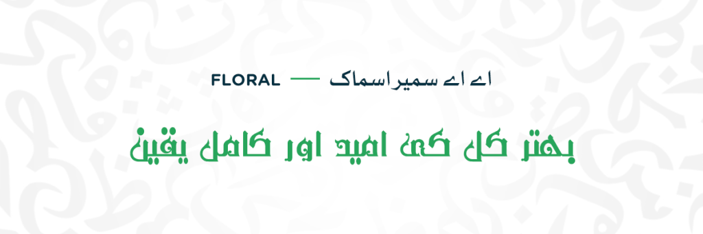
Floral style features delicate and complex designs inspired by natural elements such as flowers, leaves, and vines. This style is inspired by Arabic calligraphy and art. The letters are not monospaced but they have small, curvy strokes at the end. It is a decorative font with a thin floral design at the end that seems quite untidy. Therefore, such fonts are not suited for large blocks of text due to their decorative nature; they are better to be used in titles and shorter texts. The floral style adds a feminine and decorative touch to invitations, wedding stationery, and branding. Explore fonts like Gulzar and Farah are perfect examples of floral style.
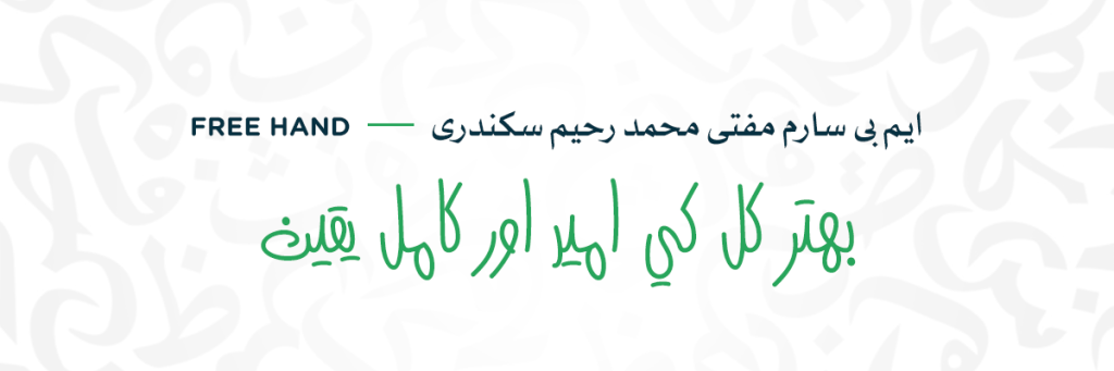
Free Hand style mimics the casual handwriting giving your text a natural feel. There is a delicacy in its irregularity and uneven appearance. This handwritten style can add warmth and personality to your designs, just like real handwriting! There is uneven spacing between letters and different thicknesses, making your text feel casual and unique. Each letter carries a unique touch of subtle imperfections reminding us of traditional calligraphy. MB Sarem Mufti Muhammad Raheem Sikandari, a Sindhi font is based on freehand style.
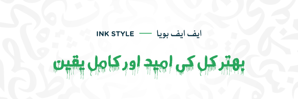
Ink-style fonts give your text a textured and artistic vibe as if it’s been dipped in ink or paint. They often look like the letters are dripping or splattered, adding a raw and expressive touch. Imagine handwritten words with dramatic flair, perfect for making a statement or setting a mood in your designs. They are often used in horror and thriller books or posters to make the words look creepy and hazardous. Some of the letters have sharp edges, which can look like they’re about to cut you. Due to its ink-like flowing nature, blood fonts also fall in the same category. Such fonts may be highly expressive but they might not suit every occasion, so use them where their bold, bloody, and unique appearance is needed. FF Bouya designed by Fahd al Faik is befitted to this style category due to its gruesome blood-like look.
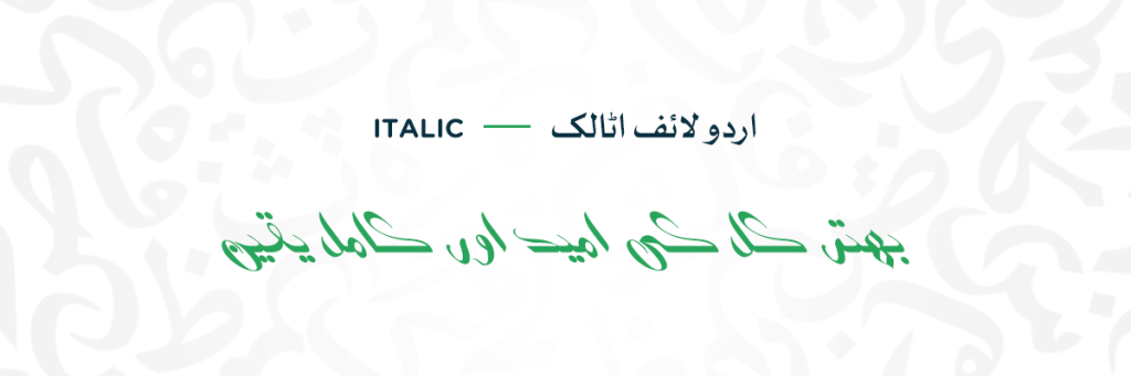
Italic fonts lean slightly to the right, adding a sense of movement and informality to your text. They’re perfect for titles, headings, and emphasis in both print and digital media. The defining feature is the tilt of the letterforms, usually to the right, although some variations might use a different angle. Diagonal strokes become more prominent compared to upright styles. The tilted angle creates more space between the letters, which can affect readability at smaller sizes. However, the italic style can be used with other styles like bolder weights, cursive styles, and more to increase its visual appeal. Many font families offer their italic version to increase their practicality. It can be used to highlight important words or phrases, like titles, headlines, keywords, or foreign language words, and in print design, social media designs, headings, and Urdu taglines.
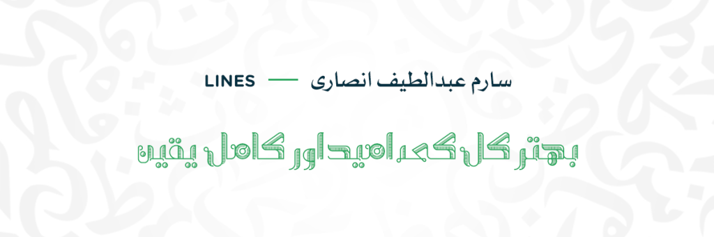
Line-style fonts are characterized by their use of straight lines to form letters, avoiding curves and intricate shapes. Each character is made from individual lines varying in thickness, length, and direction, resulting in a clean-cut and geometric outlook. Such fonts often feature playful stripes and patterns, adding visual interest and uniqueness to your design. Whether used to frame text, create borders, or add a contemporary touch to headlines, line-style fonts offer a modern and impactful look. Their simplicity and flexibility make them suitable for a wide range of applications, from digital media to print graphics. Line fonts are highly readable even at smaller sizes which increases its practicality. Many of the Naskh fonts are also regarded as line fonts due to their straight and less decorative nature.
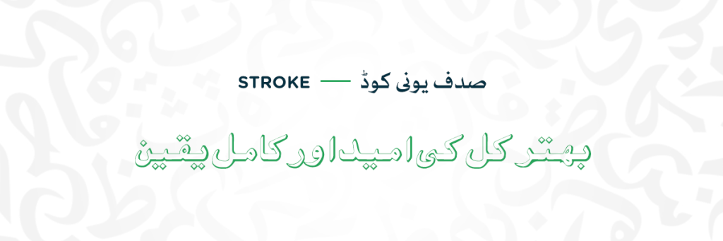
Stroke style is all about the lines, with each character built from graceful, expressive strokes that twist and turn. Stroke-style fonts feature flowing lines resembling calligraphy strokes. Each character is formed with a single continuous line, conveying a sense of motion and energy. With varying line thickness and texture, these fonts exude a dynamic and playful vibe, enhancing readability and visual appeal. Ideal for logos, invitations, and posters, stroke-style fonts add personality and liveliness to designs with their elegant and flowing appearance. Stroke style is a vast category with many sub-categories including outline, pixelated, decorative, and more. Each variation can be used to utilized to cater to various needs. Habeba and Rawaj can be categorized as Stroke fonts.
Exploring Urdu fonts reveals a diverse array of styles, each echoing cultural values and evoking distinct meanings. Understanding these styles helps you pick the right one for your message. But why does Font Style really matter? Well, understanding and using different Urdu font styles lets you connect better with your audience. Different styles can have different meanings, connecting with people in different ways. Each style can have a distinct emotional impact on the reader. Picking the right one can help your message hit the right spot. In the diverse ocean of styles, some are easier to read than others. Knowing this helps ensure your message gets across loud and clear. Whether you want to inspire, inform, or make people feel, choosing the right font style helps your message stand out. So, take the time to explore different styles and make your words alive and speak for themselves visually. Here at Urdu Fonts, we provide you with a variety of styles catering to your various needs and preferences. So, understand and choose wisely!
No comments yet
Compatible with most of the software which are of mobile, desktop and websites.


